There are five major monochromatic trends to keep an eye
Are you looking for new ways to use monochromatic into your designs? Take a look at our top five trends to get some ideas.
Monochrome, which focuses on either black and white or various shades of one colour, is a beautiful and flexible choice for artwork that is nearly as ancient as design itself.
There are numerous ways to employ monochromatic in your designs, from basic, business-friendly text to intriguing wedding stationery. It’s simple, stunning, and has endless potential. Let’s not forget about White Ink’s flexibility.
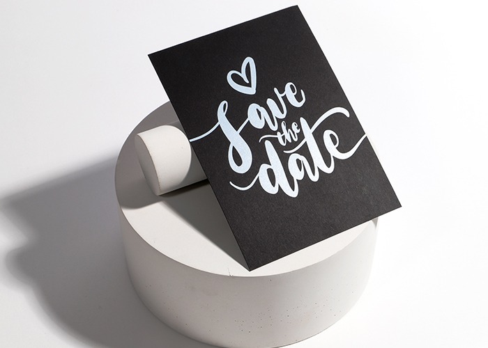
Using White Ink in a Creative Way

Let’s begin with the colour. White is typically a significant colour in monochromatic designs, and White Ink is a wonderful choice if you’re looking for a genuinely crisp strong shade.
We now painstakingly build up layer upon layer of our specialized ink until the dazzling white of the design actually stands out from the material it’s printed on, which was previously only achievable by leaving portions of your design blank. To bring out the tone and quality of the White Ink, we’ve chosen a set of six highly pigmented sheets just for it, great for creating beautiful white patterns.
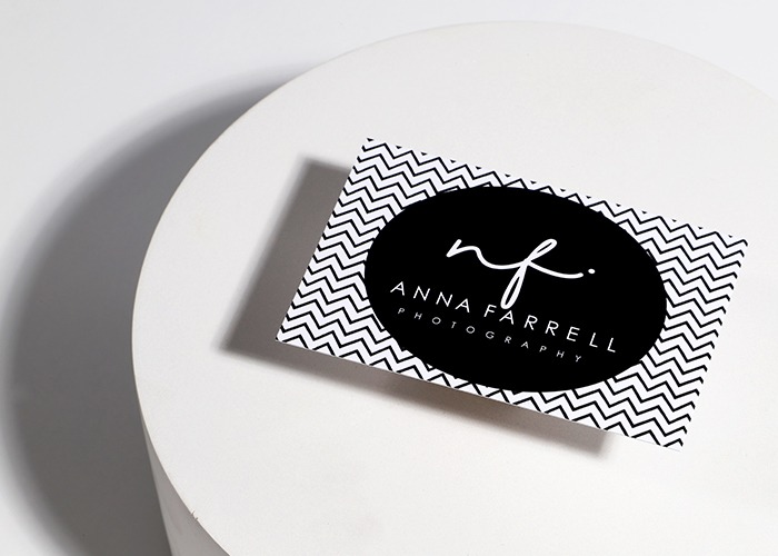
Business Cards in Monochrome

Your Business Card may be the first impression a customer has of you and your company, despite its small size. Making a statement with a monochromatic design is simple.
A black and white colour scheme helps to highlight important information while also being a quick and easy way to create a professional-looking design. When printed in such contrasting colours, contact information and logos may stand out clearly from the backdrop, and patterns gain more fascination. It provides a contemporary, luxurious finish and a style that will create a lasting impression when combined with a thick paper material or finishing like rounded corners.
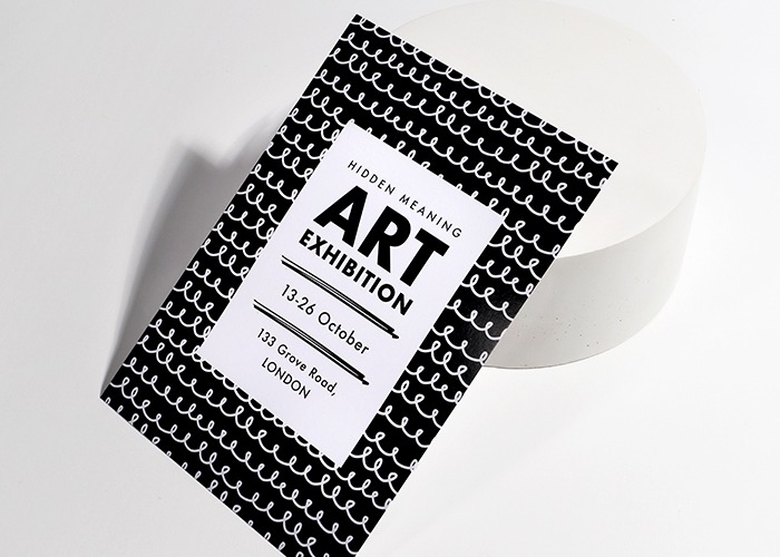
Leaflets and Flyers in Monochrome

Do you have something to brag about? Allow monochromatic to aid in the transmission of your message. Clean, vibrant messaging on a rich, block-colored backdrop will capture the eye of passers-by and make your presence known on everything from handouts to advertisements. Monochrome exudes a sense of understated elegance, making it ideal for high-end events and marketing. Consider having your design or pattern slowly fade from one colour to another for a design that truly stands out. It’s a simple yet effective technique to add more visual drama to your advertising.
Check out our tutorial at http://www.truecolors.com if you need some more ideas for your Leaflet and Flyer designs.
Comments
Post a Comment